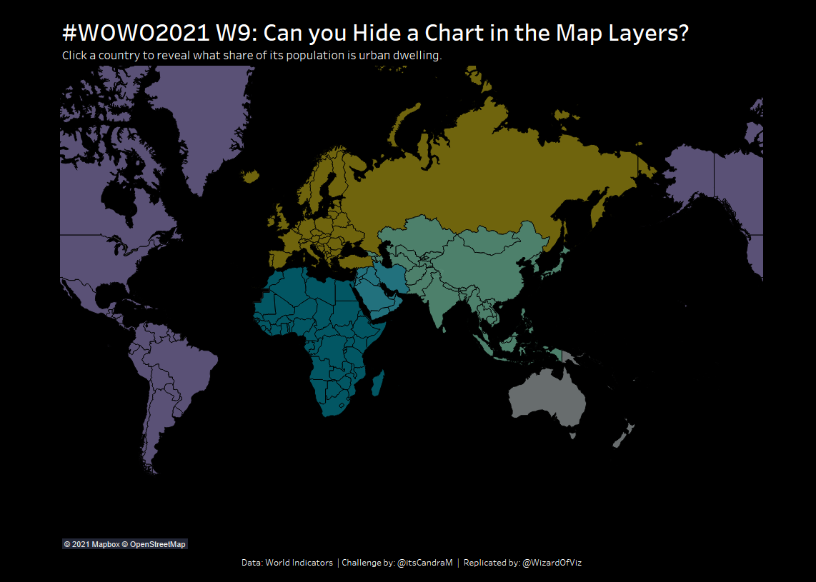
In #WOW2021 Week 4, we practiced using the new map layers functionality introduced in Tableau 2020.4. The feature allows users to overlay multiple map layers on the same map. However, this feature also allows us to overlay other chart types on the same maps. This week’s WorkoutWednesday challenge comes to use from Candra McRae requiring us to overlay a donut chart over top of the map by country, but only have it display when we select on that country.
Create Initial Map View
In order to use the multiple map layers feature, you must first start the view as a map. Initially, use Country/Region on detail, color coding by Region. Filter the data to include only data for the 2012. Use the Nuriel stone palette to color code the regions.
Create Parameter to Select Country
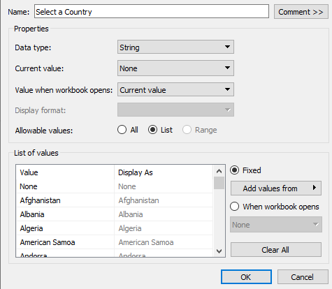
We want the user to be able to pick a country and based on the selection, view the percentage of urban population. Create a parameter based off the Country/Region field. You can select this option directly from the field by right clicking on Country/Region, selecting Create, and choosing Parameter. A new parameter is created already populated as a list of values from the Country/Region field. Add a new value “None”. This will allow the parameter to reset to no country and we will see just the map of all the countries.
Create two calculations based on the selected parameter value:
Selected Country
IF [Country/Region]=[Select a Country] THEN [Country/Region] END
Show All Countries
IF [Select a Country]=”None” then [Country/Region] END
The Selected Country field returns only the country selected by the parameter. The Show All Countries field returns all countries when the parameter is set to “None”. Both fields are currently string values. Set both of these fields to be a geographic field. Right click on the field, select Geographic Role, and then select Country/Region. Tableau will now be able to find the latitude/longitude coordinates for each country and create the filled map.
Modify Existing Map View
On the current map view, replace Country/Region on detail with the newly created Show All Countries calculated field. The map should appear the same. Add the Total Population to tooltip.
Create View for Selected Country
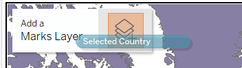
Now we are going to add three additional “map layers”, starting first with a view for just the selected country. Drag the Selected Country field into the map. An option to Add a Marks Layer will appear. Drop the field there.
A new marks card will appear for this second map layer. If needed, change the mark to Map, with Region on Color and Selected Country on Detail. Add the Population Total and Population Urban to the tooltip. Notice that the Population Urban is actually recorded as a decimal representing a percentage and not a population count. Set the default properties for this field as a percentage with 0 decimal places.
Create Donut Chart
The donut chart is actually made up of two more map layers. The first – the outside of the donut is really just a pie chart plotted at the lat/long location for each country. Use Selected Country to create a new Map Layer. Once the new layer is created, move Selected Country from Color to Detail. Change the mark type to Pie. In order for us to see the pie chart, we must make sure to use the parameter to select a country. We already have a field for Urban Population which is displayed as a percentage. We can create a second field: rural population, that when used with urban population should add up to 1.
Population Rural
1-SUM([Population Urban])
Bring Measure Names to Color, Measure Values to Angle. We need to filter the view by only the desired measures. Add Measure Names to Filters and select Population Urban and Population Rural. Increase the size of the pie chart. I made it the fullest extent possible. Set the colors for the different measures.
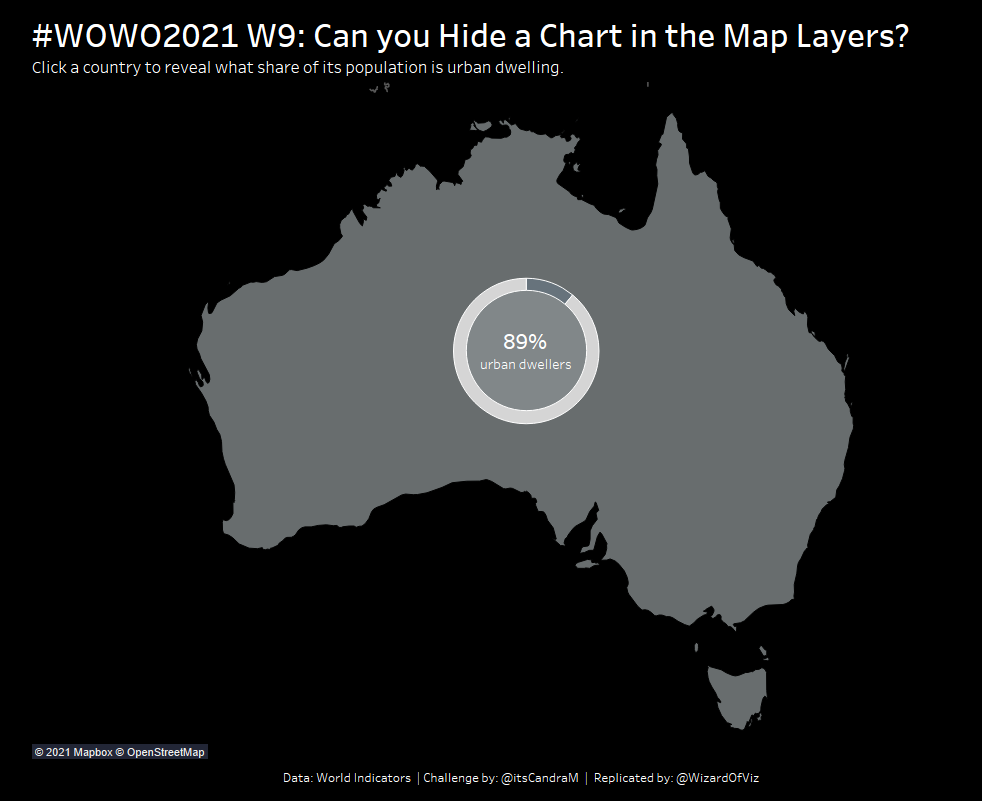
Lastly, we need to create the inside of the donut chart. Again drag Selected Country to the Map and Add a Marks Layer. Leave the mark type as a circle, but increase the size until you like the desired view. Use Region on Color to match the inside of the donut with the region of the selected country. Add Population Urban to Label, size and center appropriately and add a label of urban dwellers to the inside of the donut.
Modifying Map Layers
To make it easier to follow the multiple map layers, I like to rename the layers. Right click at the top of any of the layers and name them something easier to understand (ie. Inner Donut, Outer Donut, Selected Country, All). If you need to reorder the map layers, you can select the mark card and Move Up or Move Down as necessary. You can also choose to disable the ability for users to select from a given map layer.
Modify Map Properties
From the Map menu, change the Background Map to Dark. Modify the map layers to include only the Country/Region Borders. You may need to zoom into the map to uncheck some of the map layers that are not visible at the current zoom level.
Add Parameter Action
Bring the view onto the dashboard. From the Dashboard Menu, select Action. Add a parameter action.
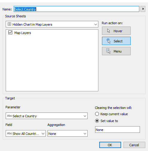
Select the correct parameter you want to impact and the specific field to change, in this case we want to use Select a Country to modify the field Show All Countries. We do not need any Aggregation. When we clear the selection, we want to set the parameter value to “None”. This is the magic that will show the map with all the countries when the parameter is set to None, but once we select a country will make the map zoom just to that country and show the donut chart for the percentage of urban dwelling.
Cleanup/Polish Dashboard
As with every dashboard, remove any legends, filters, parameters you do not need. As our map is using the black background, set the entire color of the dashboard to Black and use a black background on the title and any other text boxes you add to the dashboard. Modify the tool tips to match the formatting.
Test out the dashboard. As you select Australia, the map should filter and zoom into Australia and the donut chart should appear. Selecting Australia again will set the parameter value to None and now all countries are visible.
What’s Next?
This methodology works great when the data you want to overlay is already geographic, as it was here with countries. But this same functionality can also be used with your own “mapping” coordinates. For some inspiring uses of this feature, I recommend watching Adam McCann’s recent webinar as well as reading Luke Stanke’s informative post on next level visualizations using map layers. As noted, currently this feature only works initially with a map of some kind. Rumors are this same functionality will be expanded beyond just mapping in the future. I, for one, can’t wait!
