Last week, we learned about the Image Map extension. For this week’s Workout Wednesday, we continue exploring extensions that work with Tableau Public with a challenge by Sean Miller requiring us to use the Brush Filter extension. The extension takes any sheet on your dashboard that has a date field and a measure and creates a time line of that measure that serves as a filter to the rest of the dashboard.
Being unfamiliar with the extension I first created a visual of the timeline. I quickly realized with much joy that this wasn’t even necessary. So, for this dashboard I am using only 2 worksheets and the extension.
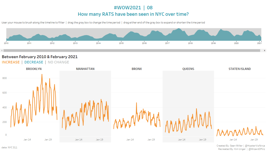
Rats by Month by Borough
With each data source, Tableau automatically creates a count of records field. We will use this and create a time line using the Month(Created Date). Adding Borough to the columns will create a separate time line for each borough. Add a filter to remove the Null Borough. Manually sort the boroughs to match the original view. Modify the formatting by removing the axis title, setting the scale to every 200, remove excess borders but add column row padding.
The lines need to be colored based on the difference between the first and last values in each borough’s time line. Create calculated fields for determining the number of rates for the first and last dates within each borough view.
Min Rats
WINDOW_SUM(if FIRST()=0 then COUNT([Rat_Sightings.csv]) END)
As this is a table calculation, you need to set the scope and direction for how the First() is calculated. Since we want to pull out the separate values for each borough, set this to compute using Pane Across. The First() function returns the number of rows from the current row to the first row in the partition. By setting this to 0, we are returning the first value, or in this case, the min date. We need to create a similar calculation for Max Rats.
Max Rats
WINDOW_SUM(if LAST()=0 then COUNT([Rat_Sightings.csv]) END)
The difference here is that we are now using the LAST() function. Again we want to set the table calculation to compute using Pane Across. The LAST() function returns the number of rows from the current row to the last row in the partition. By checking if this equals 0, we are returning the last value, or in this case, the max date.
One we have both the Min Rats and Max Rats we can calculate the difference but return a value of -1 when the result is negative, or +1 when the value is positive.
SIGN([Max Rats]-[Min Rats])
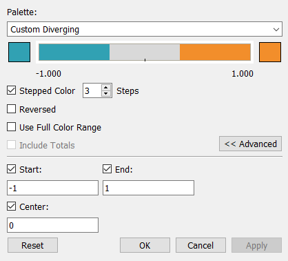
Use this calculation on color, making sure to compute using Pane Across. Set the legend to use a custom diverging color palette with the blue, orange and grey. Be sure to set the stepped color at 3 steps, with a start of -1, end of 1, and center at 0.
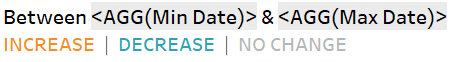
Title
Create a second view, this one capturing the start and end dates that will update as the view is filtered by date using the brush filter extension. Create two calculations:
Min Date
DATE(MIN([Created Date (Months)]))
Max Date
DATE(MAX([Created Date (Months)]))
Bring the two fields to detail or tooltip on the marks card to make them available for use in the title. Color code the difference text to align with the colors in the view.
Bring both views onto a dashboard.
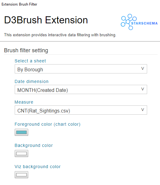
Brush Filter Extension
Download the Brush Filter Extension from the Tableau Extension Gallery. Make sure to filter the extensions to those compatible with Tableau Public. Add the extension to the dashboard. Right click on the extension to configure. Select the sheet that contains the date dimension and measure that you want to filter based on. For this dashboard, select the sheet showing the timelines by borough. Select the Date dimension as MONTH(Created Date) and the Measure as CNT(Rat_Sightings.csv). Set the foreground color, background color, and viz background color as desired.
The result of the extension is a new visualization on the dashboard. Move/resize as needed. To interact with this view, simply use the mouse to drag each end point of the grey area on the graph. This creates a filter on all sheets on the dashboard for the dates within the range.
This extension provides a valuable user interface often requested by my clients — the ability to pick a range from a graph and view only that filtered area. The use cases for this are endless. It’s been great the past few weeks using these new-to-me extensions. I’m inspired to play around with a few others, so be on the lookout for some upcoming blogs on these and more.
