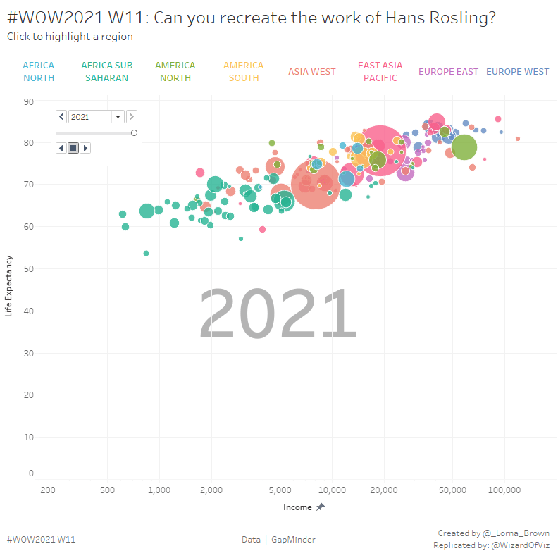
First, if you’ve never seen Hans Rosling’s infamous Ted Talk on the statistics, world development and data visualization, close this blog and immediately watch it. Ok, now that we are all on the same page, we can tackle this week’s WorkoutWednesday (albeit a few days late due to my daughter’s spring break). Lorna Brown provided us with the GapMinder data sets for this challenge and asked us to create the now famous scatterplot showing life expectancy and income per GPD, sized by population. The visualization should also automatically page through all the years until the current year, and allow for highlighting by region.
Setting up Data
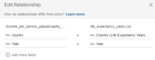
Four data sets were provided. Before we can start building the visuals, we need to relate these data sources to one another. Before we can relate the tables together, we need to do a little manipulation. All three csv files are structured such that each year is a single column. We can pivot these columns to return just two columns (one for the year and one for the respective value). Once pivoted, we can relate the tables to one another using the year and country fields.
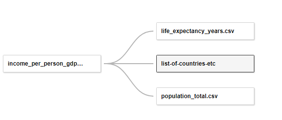
Once the data source is created, we can build three views:
- Region Selector
- Scatterplot
- Year
Create the Region Selector
From the Eight Regions field, create a new field for the region labels that will serve as a selector to highlight the data by region. To clean up the labels, use the REPLACE function to replace the underscores with spaces, and the UPPER function to change the text to all upper case.
Region
UPPER(REPLACE([Eight Regions],’_’,’ ‘))
Use this field on text and columns to create a simple crosstab legend/highlighter. Adjust the colors to match the view and remove the borders, headers and tooltip.
Building the Scatterplot
On a new worksheet, create a scatterplot comparing Income and Life Expectancy. Use Country on detail and color the circles by the Region calculated field. Size the circles by population. Modify the axis for Income to use a positive logarithmic scale and uncheck Include Zero to modify the range of the axis.
Create a calculation to show only years through the current year, add it to filters and set to True.
Show through Current Year
[Int([Year])<=YEAR(TODAY())
Filter out the Null Regions. Add Year to the pages shelf to allow the user to automate the visual over time by year. Change the background color of the view to None. This will allow us to float the scatterplot overtop of the year visual.
Showing the Year
Create a view again using Year on the pages shelf, and filtered to only those years through the current year. Use Year on text, formatting it grey and very large (72 pt). Remove the tooltip.
Create Dashboard
Set the dashboard size to 800 px by 800 px. Bring the Region Selector and Year views to the dashboard as tiled objects. Add a title and the footer. Float the scatterplot over top of the year view, using the sizing layout of the year view as a guide. Float the page slider, customizing the options and removing the history controls. Set the background layout color to white, and add a blank white object over the speed controls.
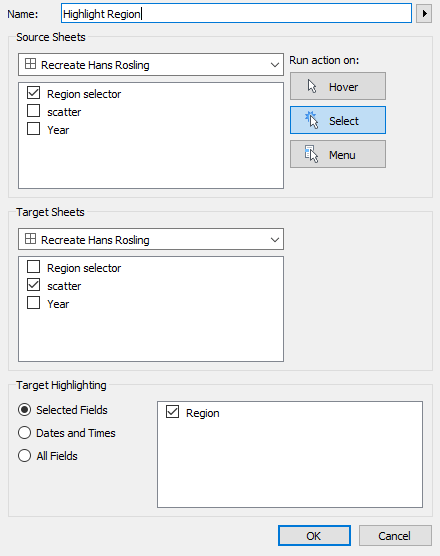
Create a highlight action from the Region Selector, such that selection a region from the Region Selector view highlights the corresponding countries within that region on the scatterplot.
Play the page selector, noticing the change to the visual with each year.
Hans Rosling’s son, Ola, originally built the Trendalyzer software to animate data compiled by the United Nations and World Bank. Hans alongside Ola and his daughter-in-law Anna Rosling Ronnlund co-founded the Gapminder Foundation to create the moving, interactive graphics to help explain international statistics such as the ones in our challenge. Now, through access of the same data, this groundbreaking visualization can be created in Tableau in less than an hour, putting the data and analytics into the hands of people that much easier. This visual, though simple, encapsulates exactly what Tableau is designed to do: helps people see an understand data. I can only assume Hans would be smiling at the thought if he were alive today.
