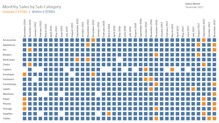
As a consultant, I am asked to find solutions to a variety of issues. Last week, I was working for a client that had created a dashboard to track when values were outside of expected ranges (any monthly value falling outside two standard deviations from their three-year average). The dashboard showed monthly indicators for 37 months (the current month and 36 months prior).
To demonstrate the issue, I have replaced the data source with Superstore. You can download the accompanying workbook from Tableau Public.

This view was ideal for their analysts, in that they could see historical trends of these indicators. However, the supervisor wanted a more summarized view – one that would only show those subcategories outside of the norm for the current (or selected) month.
The existing dashboard used WINDOW_AVG and WINDOW_STDDEV to determine those months outside of the norm. The problem, however, was that the new dashboard requirement was to only show one month at a time. Filtering the dashboard to a single month would remove those other months from the view and thus the window. The window calculations were no longer correct – they would be for the single month selected.
Here is where I came in. I was asked to find a way to make this summary view for the supervisor.
The answer: LODs!
The first challenge was to replicate the existing dashboard using Level of Detail expressions instead of Window calculations.
Instead of using WINDOW_AVG(SUM(Sales)) to calculate the average sales by sub-category across 36-months, use a nested level of detail calculation.
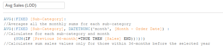
Starting at the inner LOD, first check if the month is within the previous 36 months (using a date calculation and a parameter). If it is, SUM(Sales) within each of those months for each sub-category. These months are then averaged in the outer LOD by sub-category to produce the 36-month average value for comparison.
Similarly, standard deviation can be calculated using LODs instead of WINDOW_STDEV(SUM(Sales).
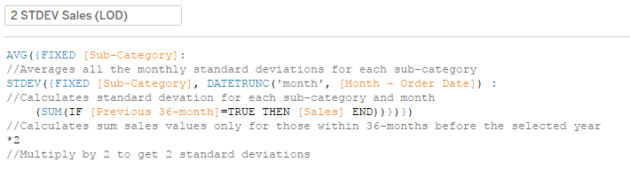
The only difference between the two LODs is the use of STDEV outside the inner LOD. This LOD takes the standard deviation of the monthly sums for each sub-category. These are then averaged and multiplied by 2 to calculate the resulting two standard deviation value for each sub-catgory.
A filter restricting the view to just 36-months prior to the current month is added as a context filter. This forces the data to first filter to the 36-months before any other filters or LOD expressions happen.
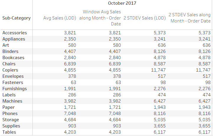
Comparing these LOD calculations against the initial WINDOW calculations, the results are validated:
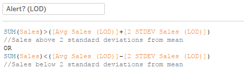
Now that the calculations have been validated, create a flag to check which monthly SUM(Sales) falls outside of the norm (median ± 2 STDEV), just as previously in the original dashboard.
This field is added to color to indicate months outside of two standard deviations from the mean.
The result looks like the original.
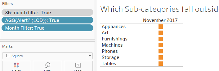
To meet the supervisor’s requirements, the Alert calculation is added to Filters to show only those where the value is TRUE. The 36-month filter is again added to context. Additionally, a month filter is created to use with a parameter, allowing the user to select the month to check for any outliers.
FIXED LOD expressions, like the ones used in this example, occur before standard filters, which allows for the calculation of the average across the multiple months despite having the single month filter. The single month filter affects what is in the view, limiting it to only the parameter selected month.
Now, as November 2017 is selected, only those sub-categories where the SUM(Sales) are outside two standard deviations from the mean are shown in the view.
If desired, this view can be added to a dashboard along with a box and whisker plot (or similar visualization) to show the list as well as where the monthly value falls relative to the other months.
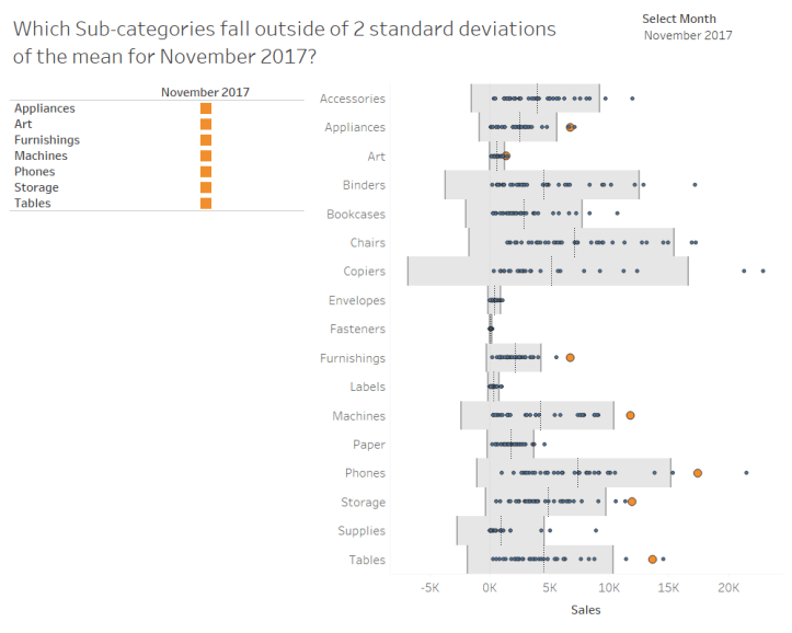
In this example, a traditional box and whiskers plot isn’t being used because Tableau extends the whiskers either to the full extent of the data or 1.5 times the IQR (inner quartile range). This is not the same as the two standard deviation requirement posed here. To achieve the same result, reference lines were placed at the mean ± two standard deviations, and the mean. Additionally, a distribution band between the two end points was added.
A calculation field was created to highlight points for the selected month that were outside of two standard deviations from the mean.
This field can be used on size and color to emphasize those points.
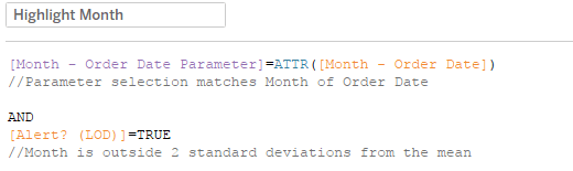
This scenario was also a good use for a recent tip by Sarah Bartlett:
Customizing tooltips with color


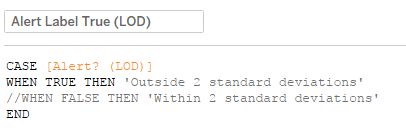
Create a calculated field to isolate only when the Alert field is TRUE.
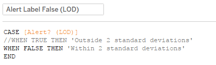
Create a similar calculation for when the Alert is FALSE.
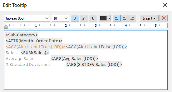
Add both fields to the same row in your tooltip, setting each field to its own color. The value will only populate from one field at a time.
I had previously used a similar technique for creating different number formats for measures from a parameter selector (for example, one measure should be presented in $, another in %). But, I had never even thought to use the same technique to dynamically color. Thanks, Sarah!

Thanks for the mention! This is an excellent LOD use case!
LikeLike