2021 Week 1: Can you Find the Variance Along the Line?
This week’s challenge comes to us from Candra McRae. The goal was simple: create a line graph highlighting two years for comparison and calculate the percent change between them. However, Candra restricted us from only uses no LODs, no calculated fields for changing the number formatting to percentages and no hard-coding any of the years into calculations. Ok…so where to start?
With all WorkoutWednesday challenges, you should start with an examination of the data. This data set was quite simple — it contained just a few fields, allowing us to explore the food insecurity and food security by year. The requested line chart showing SUM([Food insecurity (includes low and very low food security) Percent of households]) by Year cab be created.
Formatting Food Insecurity as a Percentage
Notice the food insecurity field is already at a percent magnitude. To change the format to display as a percentage, the default properties of the food insecurity field were set to a custom format of 0.0″%”. Now our values are showing as percentages both on the axis and in our tooltips.
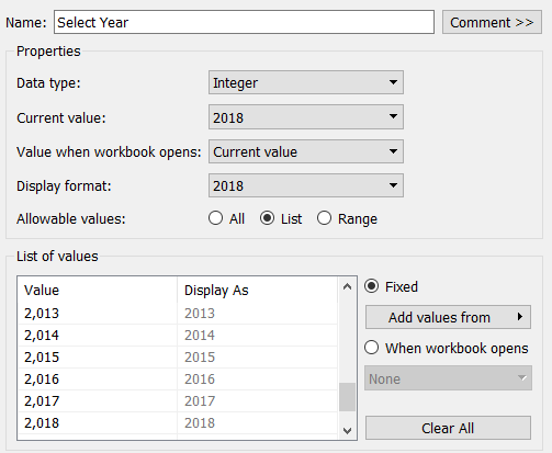
Selecting Base Year
A parameter to select the base year from the existing year field was created. The display format was set as a number with no decimal places and no thousands separator.
Next, a calculation to pull out the Food Insecurity value for the selected year was created:
Base Insecurity
SUM(IF ([Select Year]=[Year] )
THEN [Food insecurity (includes low and very low food security) Percent of households]
END)
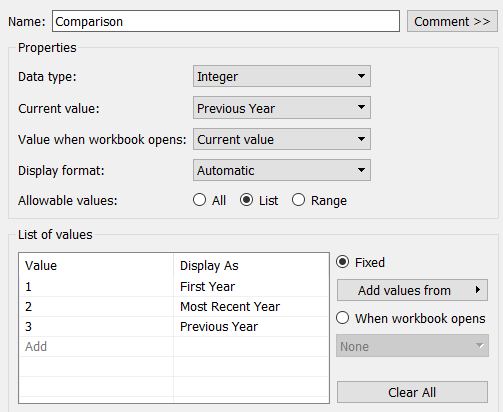
Selecting Comparison Year
A parameter to let the user select what year to compare against: First Year, Most Recent Year, or Previous Year was created.
A calculation to determine the year for comparison based on the parameter selection was used:
Comparison Year:
CASE [Comparison]
WHEN 1 THEN LOOKUP(MAX([Year]),FIRST())
WHEN 2 THEN LOOKUP(MAX([Year]),LAST())
WHEN 3 THEN LOOKUP(ATTR((IIF([Select Year]=[Year],[Year],NULL))-1) ,1)
END
The lookup function is used to find the correct year based on the parameter selection. The lookup function requires an expression, and uses a specified relative offset from the current row. In addition to using the lookup function, both the first() and last() functions were used to identify to the first or last row in the partition. When the user selects First Year, the lookup function looks at all the years and finds the first year (1995). Similarly, when the user selects Most Recent Year, the lookup function looks at all the years and finds the last year (2019).
Finding the previous year was a little trickier. For this, the Select Year parameter was used and if that equals the year, return the year, otherwise return a null value. From this, subtract 1.This only returns the value for the previous year for that specific year. All other values end up as Null. When using the lookup function now on this expression, it can only return that year.
As with the base year, a calculation to assign the food insecurity value for the selected comparison year was needed:
Comparison Insecurity
(IF [Comparison Year]=ATTR([Year]) THEN SUM([Food insecurity (includes low and very low food security) Percent of households])
END)
Adding Dual Axis to Display Points for Selected Year
To our existing line graph, a dual axis made up of both our base year and comparison year values (using Measure Names/Measure Values) was added. Changing the mark type to a circle and using Measure Names on color will allow us to view the selected years. The colors for the Base, Comparison and line graph were set based on the original view. Be sure to synchronize the axes and bring the Measure Values axis to the front to display the circles on top of the line.
Title with Calculations and Dropdown Parameters
The title was made up of the food insecurity value for the selected year, a reference to that selected year (with access to the parameter to change that year), a calculation of the percent difference between the selected and comparison years, and the ability for the user to select how to choose the comparison year (from the Comparison parameter drop down).
The following was used to display the title:
<AGG(Base Insecurity)> U.S. HOUSEHOLDS WERE FOOD INSECURE OR LACKED CONSISTENT ACCESS TO ENOUGH FOOD ( <ATTR(Base_Year)>)
<AGG(Difference)> vs. <Parameters.Comparison>
The AGG(Base Insecurity) was formatted to be larger and red to align with the selected year in our graph. A calculation to derive the Base Year based on the parameter selection was created:
Base Year
[Select Year]
This was also colored red. A little space in front of the Base Year was left to float the Base Year parameter drop down.
The percent difference between the selected base year and calculated comparison year was calculated simply as
Difference
(WINDOW_SUM([Base Insecurity])-WINDOW_SUM([Comparison Insecurity]))
/
WINDOW_SUM([Comparison Insecurity])
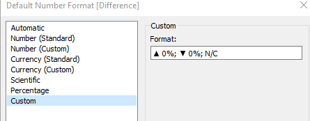
Using the WINDOW_SUM function allows it to add across the years of data, as data for the base insecurity only exists for the selected year, and the comparison insecurity only exists for the comparison year. The default properties for this field were set to use custom formatting to display the up arrow if the difference was positive or a down arrow if the difference was negative. Additionally, if there is no change (ie., the same year is selected for both the comparison and base year), it should show N/C*.
*Special thanks to @manirainasanu for pointing out that I had initially missed the no change notation.
The Comparison parameter was referenced in the title, leaving space before the value for the parameter drop down.
Tooltips and Format Cleanup
It is always important to spend some time on tweaking the tooltips. The tooltip was modified from the standard list of metrics view to the following:
<Year> | <SUM(Food insecurity (includes low and very low food security) Percent of households)> of U.S. Households were food insecure
Additionally, the axis format was set such that the scale was shown for every 5%, and all grid lines and axes lines were removed.
Creating the Dashboard
The dashboard was set to a size of 1000 x 800. The view was brought onto the dashboard with the title shown. The Select Year and Comparison parameters were brought onto the dashboard, but changed to floating. These parameters were set to be single select drop-downs, with the All value removed. They were then resized small enough to see just the drown down arrow and moved into position onto the view title.
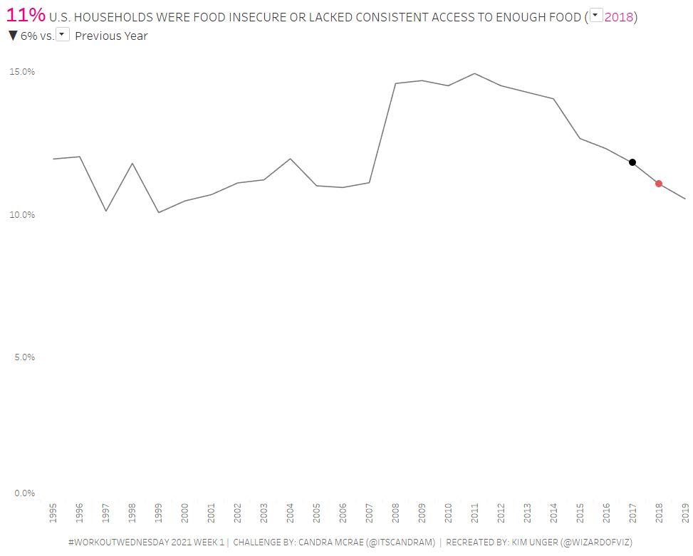
The user can interact with the dashboard by selecting the base year and which year to compare against. The circles update based on the selected/calculated years and the percentage difference is shown.
Review of Challenge
I enjoyed being restricted to using table calculations. Like the creator of the challenge, I, too, fall back on using LODs more than I should. I really liked the layout of the challenge as well, with the parameters being shrunk down to only show the drop down arrow. I can think of many uses for this design with my own current clients.
The author chose to restrict us to using table calculations…but when might you want to use a table calculation instead of a level of detail expression?
Level of Detail expressions are calculated in the data source at the granularity requested in the calculation. Depending on whether you use FIXED, INCLUDE or EXCLUDE will determine where in the order of operations this calculation will occur. In any case, they happen BEFORE any table calculations.
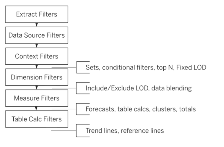
Table calculations happen lower in the order of operations. They are performed after the query returns from the data source and are calculated only over the values in that query result set. Because they happen on the resultant data set, table calculations are the only possible method for calculating ranks, cumulative totals, moving calculations or inter-row calculations.
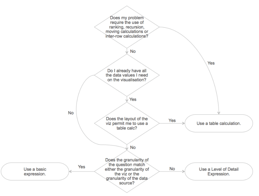
Depending on the complexity and volume of the data, complexity of the calculation and required layout, these two approaches may perform differently. It is important to look at the tradeoffs between performance, simplicity and flexibility with each of these calculations in your visualization.
All in all, this was a great start to get back in the swing of WorkoutWednesday. Be sure to check back for future challenges and solutions. One week down…51 more to go!
