One of the things I love most about Tableau is how often we get new releases. Unlike many software companies, each release brings us major new features to aid us in our analytic endeavors. Last December, Tableau released version 2020.4 and with it, introduced the concept of Map Layers. We are now able add unlimited marks layers to our maps. We’ve already seen many members of the community expand this functionality to other mark types with some clever hacking.
For this week’s WorkoutWednesday, we revisit a previous challenge (2019 Week 11) but use the new map layers features.

The challenge is made up of two views: a map with multiple layers and a bar chart. Let’s look at each of these.
Map View
We start by creating a filled map of the United States using State. In previous versions, we would have to create a dual axis map to have two different geographic marks on the same map. We were limited though to only those two. With Map Layers, we can add as many geographic marks to the map at a time. To activate map layers, drag the second geographic feature, in this case City, to the map and drop it on Add a Marks Layer.
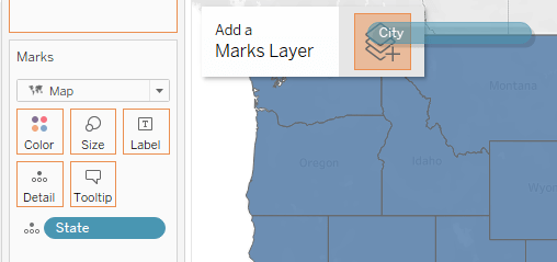
We now have a second marks card for City. This marks card specifically controls the appearance of the cities on the map.
Notice the numerous unknown values, shown by the indicator at the bottom right corner of the map. This occurs because with only City on that map layer, Tableau can not determine where some of the cities are located as the same city name is located in multiple states. To remedy this, add State to detail on the City marks card.
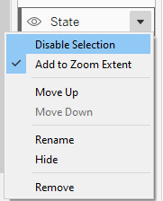
Hovering over the marks on the map, you are able to see the details for all the map layers. You can disable the selection of any marks layer by selecting the mark layer and clicking on Disable Selection. Once disabled, the user can no select or see details from the State map marks layer. From this menu, you can also reorder the marks layer (move up or move down), as needed.
For the State layer, use Sum(Profit) on color to color code each state by Total Profit. Use a Red to Black diverging scale to show the range of profit. For the City layer, we want to color code the cities by the sign of the total profit. We can create a calculation (Profit?) to achieve this:
SIGN(SUM([Profit]))
The SIGN function returns the sign of a number: 1 if the number is positive, 0 if the number is 0, or -1 if the number is negative. We can then use this Profit? field on color to color code the cities based on if their total profit is positive, negative or 0. Use the red to black diverging palette again.
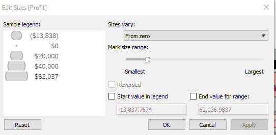
Additionally, we want to size the city circles by the SUM(Profit). Use the size on the marks card to resize the overall marks. Use the size legend to adjust the variation of the size of the circles by varying them from zero.
To match the tooltips that appear when you select a city, we need to tackle two issues:
- Create State Abbreviation field, from which we create a City, State field
- Create two independent fields for Profit depending on whether the value is Positive or Negative (or zero).
State Abbreviation
CASE [State]
WHEN ‘Alabama’ THEN ‘AL’
WHEN ‘Alaska’ THEN ‘AK’
WHEN ‘Arkansas’ THEN ‘AR’
WHEN ‘Arizona’ THEN ‘AZ’
WHEN ‘California’ THEN ‘CA’
WHEN ‘Colorado’ THEN ‘CO’
WHEN ‘Connecticut’ THEN ‘CT’
WHEN ‘Delaware’ THEN ‘DE’
WHEN ‘District of Columbia’ THEN ‘DC’
WHEN ‘Florida’ THEN ‘FL’
WHEN ‘Georgia’ THEN ‘GA’
WHEN ‘Idaho’ THEN ‘ID’
WHEN ‘Illinois’ THEN ‘IL’
WHEN ‘Indiana’ THEN ‘IN’
WHEN ‘Iowa’ THEN ‘IA’
WHEN ‘Kansas’ THEN ‘KS’
WHEN ‘Kentucky’ THEN ‘KY’
WHEN ‘Louisiana’ THEN ‘LA’
WHEN ‘Maine’ THEN ‘ME’
WHEN ‘Maryland’ THEN ‘MD’
WHEN ‘Massachusetts’ THEN ‘MA’
WHEN ‘Michigan’ THEN ‘MI’
WHEN ‘Minnesota’ THEN ‘MN’
WHEN ‘Mississippi’ THEN ‘MS’
WHEN ‘Missouri’ THEN ‘MO’
WHEN ‘Montana’ THEN ‘MT’
WHEN ‘Nebraska’ THEN ‘NE’
WHEN ‘Nevada’ THEN ‘NV’
WHEN ‘New Hampshire’ THEN ‘NH’
WHEN ‘New Jersey’ THEN ‘NJ’
WHEN ‘New Mexico’ THEN ‘NM’
WHEN ‘New York’ THEN ‘NY’
WHEN ‘North Carolina’ THEN ‘NC’
WHEN ‘North Dakota’ THEN ‘ND’
WHEN ‘Ohio’ THEN ‘OH’
WHEN ‘Oklahoma’ THEN ‘OK’
WHEN ‘Oregon’ THEN ‘OR’
WHEN ‘Pennsylvania’ THEN ‘PA’
WHEN ‘Rhode Island’ THEN ‘RI’
WHEN ‘South Carolina’ THEN ‘SC’
WHEN ‘South Dakota’ THEN ‘SD’
WHEN ‘Tennessee’ THEN ‘TN’
WHEN ‘Texas’ THEN ‘TX’
WHEN ‘Utah’ THEN ‘UT’
WHEN ‘Vermont’ THEN ‘VT’
WHEN ‘Virginia’ THEN ‘VA’
WHEN ‘Washington’ THEN ‘WA’
WHEN ‘West Virginia’ THEN ‘WV’
WHEN ‘Wisconsin’ THEN ‘WI’
WHEN ‘Wyoming’ THEN ‘WY’
END
City State
[City]+’, ‘+[State Abbreviation]
Drag City State to tooltip to make it available within the customized Tooltip.
Profit +
IF SUM([Profit])>=0 THEN SUM([Profit])
END
Profit –
IF SUM([Profit])<0 THEN SUM([Profit])
END
Set the default formatting for both these fields to Currency Custom (0 decimal places, with (-1234) formatting for negative values). Bring both Profit + and Profit – to Tooltip. Having these separate fields allows us to use both in the tooltip and independently format each field, specifically coloring the Profit – field as red and the Profit + field as black. Create the Tooltip as shown below:

Bar Graph
The bar graph was the simpler of the two visualizations. Create a bar graph using the City State calculated field and Sum(Profit). Color the bars by Sum(Profit). Bring both Profit – and Profit + to Tooltip on the Marks card to create the same tooltip from the Map view. Edit the SUM(Profit) axis to show major tick marks every 20,000.
Create Dashboard
Bring both the Map and Bar views to a dashboard using the Generic Desktop size. The legends will appear in a vertical container on the far right of the dashboard. Only show the legend for Profit (from State) and the Profit size (from City). Select the container and change it from tiled to floating. Relocate the container at the bottom left of the map. Add a text box in the container for the Profit Legend title and hide all the titles for the two legends.
Add a highlight action from the bar chart to the map.
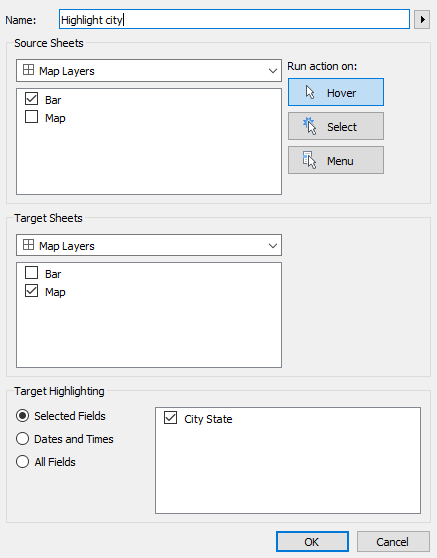
By default, selecting a city on the map will highlight just the selected city on the map, dimming out all other cities. Create a dummy highlight action to remove this functionality. Create a dummy placeholder calculated field: Highlighter, just referencing the string “Highlight”. Adding this to detail on the map layers makes that field available for highlighting. Create a second highlight action to highlight all marks, not just the selected one.
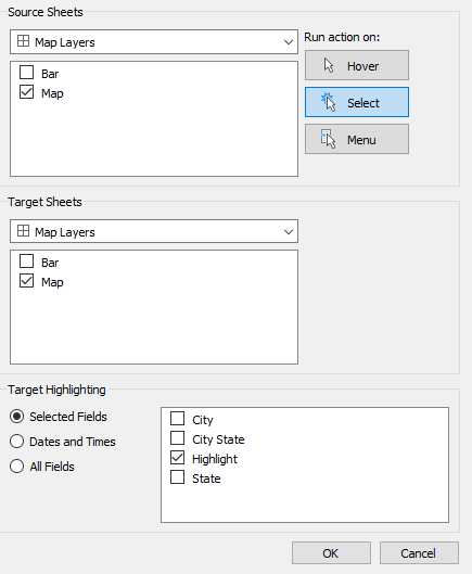
Now, when you select a city to view the details, it won’t highlight that city, rather it is actually highlighting all marks since they all contain the same value for the Highlight field.
Final Thoughts
This practice was a great way to get some experience using map layers. The possibilities here are endless. Tableau’s roadmap already calls for utilizing this same functionality to become available for other mark types in the near future. Until then, check out the blog posts from Luke Stanke and Jeffrey Shaffer for some clever adaptations of this technique. Tableau 2020.4 also gave us enhanced predictive modeling including the ability to show future values. I’ll highlight this new functionality in an upcoming blog as I anxiously await the next Tableau beta version.
