It’s funny how things happen. I was already planning on writing about Tableau’s new predictive modeling capabilities. Imagine my excitement when Candra McRae used it as the main topic of this week’s WorkoutWednesday. This week’s challenge: use enrollment data for Historical Black Colleges (HBCs) and, using Tableau’s new predictive modeling, forecast enrollment to 2023.

The dashboard is made up of two views: the area graph with the forecast vs actuals and the parameter selector. Through Parameter Actions, the user selects the parameter and the graph displays the selected measure. The forecast uses the new function: MODEL_QUANTILE to find the 50th percentile values of the selected measure based on the date. The title adds some additional complexity to the challenge, as we have to isolate the values for the last year of the forecast and actuals.
Select Measure
The view uses three measures:
- Total Enrollment
- % Black Students
- % Non-Black Students
Create a list parameter with each of the measures as options. Create a calculation referencing that parameter to assign calculations based on the selected measure:
CASE [Select Measure]
WHEN ‘Total Enrollment’ THEN SUM([Total enrollment 2 All students])
WHEN ‘% Black Students’ THEN SUM([Total enrollment 2 Black students])/SUM([Total enrollment 2 All students])
WHEN ‘% Non-Black Students’ THEN 1-(SUM([Total enrollment 2 Black students])/SUM([Total enrollment 2 All students]))
END
Create Forecast
To create a forecast we need an actual date field. Convert Year 1 into a Date. Use Continuous Year on columns and Selected Measure on Rows. Change the mark type to area. Show the parameter and notice how the value changes based on the selection. For this analysis, filter the view by Year to include those years starting in 1993. Create the forecast using MODEL_QUANTILE:
The function MODEL_QUANTILE returns a target value within the probable range of the selected measure based on the year, at the desired quantile. It follows the following syntax:
MODEL_QUANTILE(model_specification (optional), quantile, target_expression, predictor_expression(s))
It should be noted that this functionality should not be used without some understanding of the appropriate model type for your data.Tableau currently supports the following model types:
- Linear regression (default, also known as ordinary least squares or OLS): Use when you have only one predictor, and that predictor has a linear relationship with your target metric. Use “model=linear”.
- Regularized linear regression (also known as multicollinearity): Use when you have multiple predictors, especially when those predictors have a linear relationship to the target metric and those predictors are likely affected by similar underlying relationships or trends.
- Gaussian process regression: Use when you have time or space predictors, or when you’re using predictors that might not have a linear relationship with the target metric.
In our case, we are using a Gaussian process regression (“gp”) to perform our predictive modeling since we are predicting our selected measure based on the year and it is not a linear relationship. We would write our forecast calculation as:
MODEL_QUANTILE(“model=gp”,0.5, [Selected Measure],ATTR(DATETRUNC(‘year’,[Year 1])))
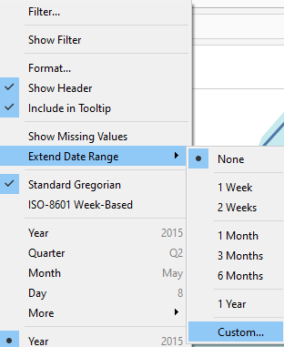
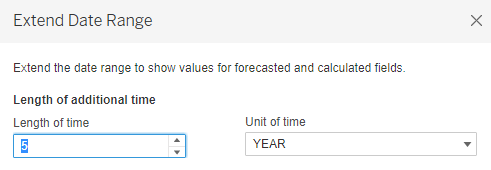
Add this new field to rows, set it as a dual axis and set the mark type to line. Be sure to synchronize the axes. To show the trend at a finer detail, edit the axis and uncheck include zero. This limits the range of the axis. Be careful in removing this option as it can cause your view to be deceptive, as users are used to graphs normally ranging from 0. Currently, the forecast only shows through the years with actual data. From the Year field on columns, select Extend Date Range. From here you can specify how far out beyond the current time frame to forecast. Set the forecast for 5 years.
Clean up the view by hiding the axes, hide the null indicator, and remove the title for the year axis.
Customizing the Tooltip
Because the metrics are in different units (one is number of enrollments while the other are % of students), we need to format the selected measure differently based on the parameter value. There are multiple methods to do this; we will walk through two different options in this dashboard – one for use in the tooltip, and one in the title.
Method 1: Create two calculations based on the display unit and format the default number format as desired
For this option, two separate calculations are created, one when the Total Enrollment is selected (displayed as a number with one decimal point, in the thousands) and second for % of Black Students or % of Non-Black Students (displayed as a percentage with one decimal place).
Selected Measure (#)
CASE [Select Measure]
WHEN ‘Total Enrollment’ THEN SUM([Total enrollment 2 All students])
END
Selected Measure (%)
CASE [Select Measure]
WHEN ‘% Black Students’ THEN SUM([Total enrollment 2 Black students])/SUM([Total enrollment 2 All students])
SUM([Total enrollment 2 Black students])/SUM([Total enrollment 2 All students])
END
These fields can be used on the tooltip. Depending on the parameter selection only one of these fields will have a value. The same approach can be used to create separate fields for Forecast. Additionally, we want to include a Prediction Residual, which is the difference between the actual Selected Measure and the Forecast. Set the default format for the Residual fields, making sure to use a custom format that includes the + and – to show the change. Once all those fields are created, we used them in the tooltip as follows:
<YEAR(Year 1)> | <Parameters.Select Measure>
Actual: <AGG(Selected Measure (#))><AGG(Selected Measure (%))>
Prediction: <AGG(Forecast (#))><AGG(Forecast (%))>
Residual: <AGG(Prediction Residual (#))><AGG(Prediction Residual (%))>
Be sure to create the tooltip in the All Marks card so the tooltip is visible from both the area and the line.
Change Parameter Value
Create a second sheet for use on the dashboard to allow the user to select the value for the parameter. We need to create a pseudo field that can represent the three selections. I used the year field, but you can use any dimension that has at least three members.
CASE YEAR([Year 1])
WHEN 1980 THEN ‘Total Enrollment’
WHEN 1982 THEN ‘% Black Students’
WHEN 1984 THEN ‘% Non-Black Students’
END
Use this field to create a crosstab, formatted as shown in the example. Filter the view to only include those values specified in the calculation.
Bring both worksheets into a dashboard. We need to create a parameter action that changes the value of the parameter based on what is selected from the Parameter Selector worksheet.

Identify Last Actual and Last Forecast for Title
The visuals and parameter actions are finished, but one last challenge still remains: pulling out the last actual and last forecasted values for use in the dashboard title. Here, we will use the second method of formatting the values based on the selected parameter value.
Method 2: Create a field for the value and a second field for the units.
Last Predicted Year Value:
CASE [Select Measure]
WHEN ‘Total Enrollment’ THEN
(IF LAST()=0 THEN [Forecast] END)/1000
ELSE
(IF LAST()=0 THEN [Forecast] END)*100
END
This calculation uses the LAST() table calculation to check to see if the partition is the last partition (ie., last year) then return the result of the Forecast calculation (the model_quantile calculation created earlier). In this case, we are not using separate fields for enrollment vs percentages. Rather, we are building in the math to return the values as a number with one decimal place. To this, we must create a field to identify the unit to display based on the parameter selected.
Units:
CASE [Select Measure]
WHEN ‘Total Enrollment’ THEN ‘K’
ELSE ‘%’
END
We must also create a field to pull out the last actual value (from the selected measure) and use the same method to isolate the value and use with the Units field.
Last Actual Value
CASE [Select Measure]
WHEN ‘Total Enrollment’ THEN (IF MAX({FIXED : YEAR(MAX([Year 1]))}=YEAR([Year 1])) THEN [Selected Measure] END)/1000
ELSE (IF MAX({FIXED : YEAR(MAX([Year 1]))}=YEAR([Year 1])) THEN [Selected Measure] END)*100
END
For this calculation, we are using a fixed level of detail to determine the max of all the years in the data source and if the year matches that, return the selected measure. From here, we apply the same logic to convert the value based on the selected parameter value.
Lastly, we can compare the last actual year to last forecast year to label if the difference is an increase or decrease.
IF [Last Predicted Year Value]> [Last Actual Value ] THEN ‘increase’ else ‘decrease’
END
Bringing all the fields into our view allows us to create the following title:
By 2023, <Parameters.Select Measure> at HBCUs is expected to <AGG(Increase/Decrease)> to <AGG(Last Predicted Year Value)><ATTR(Units)> (vs <AGG(Last Actual Value )><ATTR(Units)> in <AGG(Last Actual Year)>)
As the user interacts with the parameter selector, the view changes and the title updates accordingly.
This challenge was a great introduction to the new predictive modeling capabilities available in Tableau 2020.4. In addition to MODEL_QUANTILE, there was also another predictive modeling function introduced: MODEL_PERCENTILE.
MODEL_PERCENTILE returns the probability (between 0 and 1) of the expected value being less than or equal to the observed mark, based on the target expression and other predictors
MODEL_PERCENTILE(model_specification (optional), target_expression, predictor_expression(s))
It uses the same inputs as MODEL_QUANTILE except that it does not include the percentage at which to return the predicated values, rather it returns the relative percentage of the values.
With the addition of these two predictive modeling functions, Tableau has moved beyond their somewhat limited one-click forecasting to allow more options and the ability to select the predictor. I look forward to bringing them to my own clients soon.
