No matter who my client is, I can never fully move them away from wanting some kind of crosstab. People are used to looking at their data in a tabular format. It is easy for them to understand. Sure, it might not provide the quickest insights, but at the end of the day, people are comfortable with them.
This week’s WorkoutWednesday from Ann Jackson understands this and challenges you to take your standard crosstab up a notch with the use of some fancy formatting and calculations.
Calculations
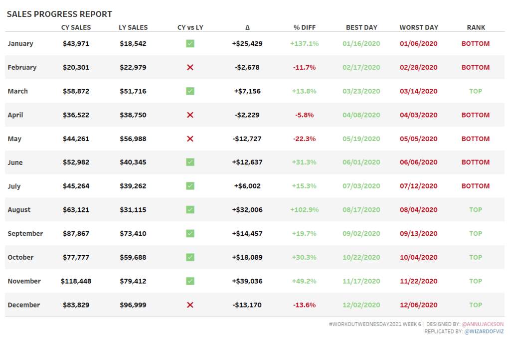
On the surface, the challenge may look simple. However, only Measure Names and Measure Values are allowed to display the various metrics (even the dates and string values). All together there are eight calculations needed to create this view.
CY Sales
To calculate the current (or most recent year) we can use a fixed LOD calculation. This calculation finds the max of all the years and checked against each year. If the years match, return the sales and sum.
SUM(IF {FIXED : MAX(YEAR([Order Date]))}=YEAR([Order Date]) THEN [Sales] END)
LY Sales
Similarly, to calculate the previous or last year sales, subtract 1 from the max year and check this against the year. If it matches, return the sales and sum.
SUM(IF {FIXED : MAX(YEAR([Order Date]))}-1=YEAR([Order Date]) THEN [Sales] END)
CY vs LY
We want to create an indicator to compare CY and LY Sales. Using values of 1 and -1 make it easier to format the field.
IF [CY Sales]>[LY Sales] THEN 1 ELSE -1 END
The default format for this field is set as ✅;❌
Using a custom format allows to specify the format for positive, negative, and 0 values. In this case, we have substituted a number format with symbols. The checkmark will display when CY Sales > LY Sales; the X when CY < LY Sales, and the – when they are equal. We will address the color formatting later.
Diff Sales
Calculate the difference between the CY and LY Sales fields. Set the default formatting to include + and – to show the magnitude of the difference as “+$”#,##0;”-$”#,##0.
([CY Sales]-[LY Sales])
% Diff Sales
Calculate the percent difference. Set the default formatting as +0.0%;-0.0%.
([CY Sales]-[LY Sales]) / [LY Sales]
Best Day
The next calculations were the trickiest. We are asked to display a date in the crosstab. In order to do that, we must have an aggregated expression. LODs are a great way to aggregate such values.
MAX(INT(IF {FIXED [Order Date]: ([CY Sales])}=
//Max Sales
{FIXED MONTH([Order Date]), YEAR([Order Date]):
MAX({FIXED [Order Date]: ([CY Sales])}
)} THEN [Order Date] END))+2
Let’s start from the inside of this calculation – determining the Max Sales from a single day within each month. For each Month and Year of Order date, find the max CY Sales value. This is then compared to the CY Sales for each day. If they match, the Order Date is returned. To display in our table, we need to convert this into an integer and aggregate by using MAX. The resultant date is actually two days short of the expected value. We solve this by just adding 2 at the end.
This is only half of the cleverness. Our resultant value is an integer but we want to display it as a date. We can’t format a number as such. However, we can temporarily change the format of the field to Date. This will allow you to set the default formatting as mm/dd/yyyy. Change the field back to a string and use in the crosstab.
Worst Day
Similarly, we can calculate the Worst Day. The only difference, we are looking for the Min value.
MAX(INT(IF {FIXED [Order Date]: ([CY Sales])}=
//Min Sales
{FIXED MONTH([Order Date]), YEAR([Order Date]):
MIN({FIXED [Order Date]: ([CY Sales])}
)} THEN [Order Date] END))+2
Again, change this to a date and format as mm/dd/yyyy. Change the field back to a string.
Rank
Just like we set the formatting with some trickery for our CY vs LY, we can do the same here for our Rank. We want to categorize those five months with highest CY Sales as TOP and the lowest months as BOTTOM. We can use RANK with the CY Sales field, in descending order, to get the rank value. If this is <= 6, a 1 is assigned, otherwise -1.
IF RANK([CY Sales],’desc’)<=6 THEN 1 ELSE -1 END
Set the default formatting as “TOP”;”BOTTOM”.
Color Formatting
Build the crosstab using Measure Names and Measure Values, such that each column is a different measure from above. Bring Measure Values to color. From Measure Values on color, select Use Separate Legends.
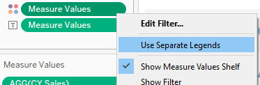
This creates a unique legend for each measure. For all measures that are shown in black font, modify the legend to use a Custom Diverging palette, but set both the start and end colors as black. Use 2 steps. Use this approach to color CY Sales, LY Sales, and Diff Sales.
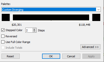
Similarly, use this methodology for Best Day and Worst Day but using all green for Best Day and all red for Worst Day.
For the CY vs LY, % Diff Sales, and Rank calculations, use the same methodology but set the end points as red and green for the diverging palette. Again set the number of steps to 2. Use the Advanced settings to set the center at 0. This will force the colors to change based on if the value is positive or negative.
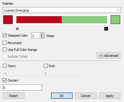
Because we created the CY vs LY and Rank calculations to return either 1 or -1 values, the two selections form the opposite ends of the color spectrum.
Lastly, since I named this fields using mixed case, edit the Aliases for the measure names to use all upper case text.
Incorporating these formatting tricks and calculations into your next crosstab will elevate your analytics and make the data easier and quicker to derive insights. Hopefully these example metrics can open your eyes to other uses and you can fancify your own crosstabs.
