Extensions have been an integral part of adding additional functionality to your Tableau Dashboards. Currently, only a few extensions work on Tableau Public (starting with version 2020.1). Tableau recently released news that even more extensions will become available to Tableau Public in future releases. In this week’s WorkoutWednesday, Lorna Eden introduces us to the Image Mapping Filter extension which allows the use of an image to be connected to dimension members to filter views on the dashboard.
Creating the Data Source
The challenge used two data sets: Emoji Sentiment & Emoji Database and required a relationship between them to be set up. Set up a relationship between Codepoints (from emoji_df.csv) and Emoji_Sentiment_Data_v1.0.csv with the calculation: UPPER(SPLIT([Unicode codepoint],’0x’,2)). The data contained information on the usage of different emojis in tweets, and the sentiment of each emoji
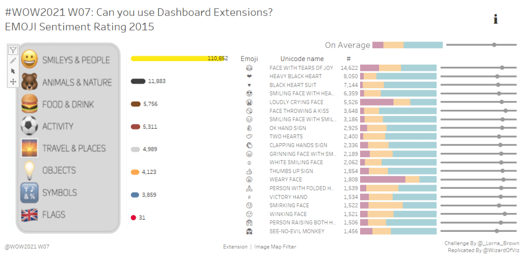
There are three main views on the dashboard:
- Sentiment Analysis by Emoji
- Average Sentiment Analysis
- Total Occurrences by Category
Sentiment Analysis by Emoji
This view is made up of three parts: the emoji, corresponding unicode, and count of occurrences as text, a stacked bar chart for sentiment analysis, and a dot/line chart for position in tweet. Using Emoji, Unicode Name and SUM(Occurrences) as discrete fields on rows, provides the textual details. To match the labeling formatting of the view, the SUM(Occurrences) was saved as a calculated field called # for use throughout the workbook. From this field, we needed to calculate the percent of three sentiments relative to the total number of occurrences:
Positive %
(SUM([Positive]) / ([#]))
Negative %
(SUM([Negative]) / ([#]))
Neutral %
(SUM([Neutral]) / ([#]))
These three fields are used together as a shared axis, using measure names and measure values to stack together to add up to 100%. Be sure to set the scale of the axis from 0.0 – 1.0. Color code the measure names using the purple, yellow, blue colors shown in the example. Sort the measure names in order of % Positive, % Neutral, % Negative.
The third part of the view uses a dual axis to plot a circle for the position relative to the entire value of 1 as a line (or in this case a thin bar). Using the AVG(Position) and the MAX(1) as the two measures in the dual axis. With the dual axis, separate marks card will allow you to set the properties for each mark. Set the MAX(Position) as a circle and MAX(1) as a bar. Set the size of the bar as small as possible.
Create a tooltip to match the view, color coding the % sentiment measures to match with their respective bars. Hide all axis labels. Add a top N filter based on Codepoints. Set this to show the top 20 based on the (#). Also remove any Nulls. Create a group based on the field group to categorize People & Body with Smiles & Emotion and call it Smileys & People. Additionally, group Activities and rename it Activity. Add this field as a context filter. This is necessary so when we filter by the image later, it will determine the top 20 emojis after first filtering on that group.
Average Sentiment Analysis
Create a copy of the previous view. We can use this as the starting point for our Average Sentiment Analysis view. Remove the Codepoints top N filter and remove the Group (group) from context. Remove all fields from rows. Add an add-hoc title of ‘On Average’ on rows to create the label. I created a field called Avg Tweets as AVG(Occurrences) for use in the tooltip.
Total Occurrences by Group
For this view, we are using what looks like a double rounded-edged bar. It is actually just a line running from AVG(0) to the SUM(#). Start by using SUM(#) on columns. Create an ad-hoc calculation for the AVG(0). This will serve as the starting point of the line. Bring the AVG(0) calculation to the same axis to activate Measure Names and Measure Values. Change the mark type to a line. Rather than have Measure Names on Rows, bring Measure Names to path. This creates the rounded ended line between 0 and the total occurrences (SUM(#)). Add the Group(group) field to Rows. Hide this header, and add labels for the occurrences, labeling only the one end of the line. Color by the Group(group) and match the colors to the view.
Info Button
The last view for the dashboard is simply used to display information about the data and extension. A quick look over the emojis, and it was determined that the emoji named “information” was used as the icon on the dashboard. Filter the view accordingly and bring Emoji to text. Size as needed. For the tooltip, add the details about the data and the extension. This approach is often used to provide supplemental information about a dashboard.
Image Map Filter Extension
The last part of the dashboard used a static image. Lorna already created this for us, but we could’ve created our own. Adding this to the dashboard to the left of the Total Occurrences by Group view provides a nice visual context. However, we did not stop there. We can add the Image Map Filter extension to designated sections of the image as clickable filters. Rather than add the image, we can add the image within the context of the extension. To add the extension, drag the extension to wherever you want the image on the dashboard. Next, configure the extension.
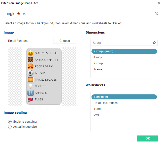
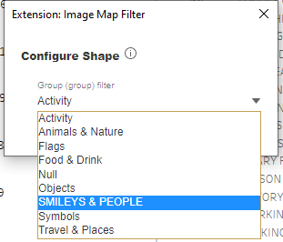
Select the image to display, the dimension with which you want to tie out the filter, and what view (or views) you want to be the target of the filter. Here we are setting this to filter based on the Group (group) on the Sentiment view.
Use the pen to create shapes around the different sections for the image that you want to serve as a filter.
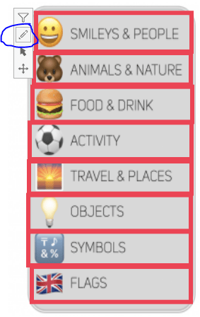
Drawing a rectangle, for example, around SMILEYS & PEOPLE, allows you to then assign the Group (group) to filter when selecting anywhere within that rectangle. Repeat this process for all the sections of the image to serve as filters, selecting the specific Group (group) member to filter.
Selecting from the image filters the sentiment analysis view. Deselecting returns the filter to show all groups. This extension brings a better user interface to the dashboard. I can definitely see using this extension with clients in the near future. We often use custom logos tied to parameters on our dashboards. Now, however, we can use this extension instead for a seamless filter experience. I encourage you to check out the numerous extensions currently in the Tableau Extension Gallery. As mentioned earlier, not all work on Tableau Public, however more and more should be available in later releases.
