This week’s WorkoutWednesday brings to an end the banging my head against the wall at the hands of Andy Kriebel and Emma Whyte. Andy and Emma have decided to take a break from tormenting, err, challenging, us with their weekly exercises. Going forward, the great Rody Zakovich will be taking the reigns. I fully expect more head scratching, mind bending challenges and welcome this new blood to my favorite weekly activity.
This week’s challenge:
Requirements
- Get the data from data.world
- Andy used the Raleway font, but if you can’t use it, don’t worry about it.
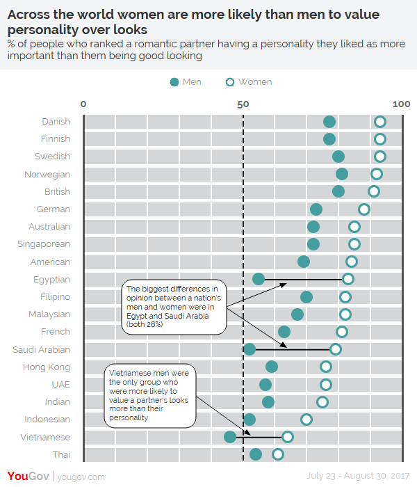
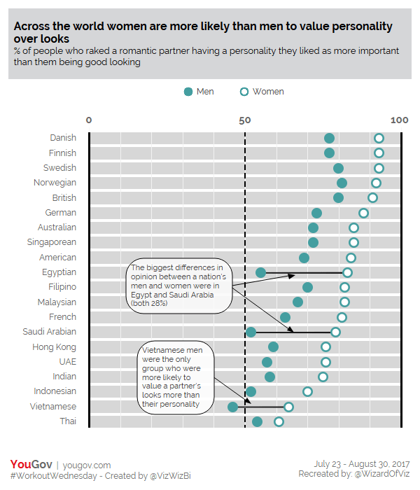
- The dot plot must show a close circle for men and an open circle (filled white) for women.
- There should be two annotations that point to three places.
- The three places where the annotations points to must show the dots connected.
- The dashboard is 600×700.
- Match the title, legend and footer.
- Match the tooltips.
- There must be solid vertical lines for 0 and 100 and a dashed line at 50 with labels for each at the top of the viz.
- There must be white vertical gridlines every 10%.
- There must be white space between each nationality.
How did I solve it?
The view is a dual-axis chart filtered on the measure for “Ranked personality higher than looks”. The Value is plotted as one axis using custom shapes and the value for only the three annotated countries is plotted as the second axis as a line. For the line, I placed gender on path to draw the line between the two circles.
Three annotations were added to point out those countries with the lines, with one of these being blank such that all that appears is the line/arrow. A little tinkering with the location of this annotation and the overlap looks as if the line is coming from the same place.
The countries were sorted in descending order based on the value of women. A constant reference line was set at 50, and a reference band was set ranging from 0 to 100 (see biggest challenge below).
I set manual ranges for the axes of -3 to 103 to give some extra white space around the chart. Additionally, the tick marks for the Value axis were set to None, while the tick marks for the Line were fixed for every 50 units. Add in some white row dividers, clean up the tool tips, and the viz was complete.
Biggest Challenge:
It took me a while to figure out that the grey shading in the pane was actually a distribution band. However, once I was able to hover over the 0 and 100 lines, it became clear that these were reference lines, and more specifically the end points of the distribution band.
Coolest Trick:
It was easy to derive that gender was used for the shape in the visualization. These were clearly custom shapes. Going back to a previous finding of mine, I used the Shape Extractor Bookmarklet to extract Andy’s custom circles. I downloaded the zipped file, extracted the Icons folder and added this custom shape directory to my existing Shapes folder in my Tableau Repository. The shapes are now available for use.
A huge thank you to Andy and Emma for a great year of #WorkoutWednesday challenges. I can’t wait to see what Rody has in store for me this year! But if his tweet is any indication, I better hang on tight!